Bootstrap Custom Forms
In this tutorial you will learn how to create custom form controls with Bootstrap.
Creating Custom Form Controls
Bootstrap enables you to customize the browser's default form controls to create even more elegant form layouts. Now you can create completely customized and cross-browser compatible radio buttons and checkboxes, file inputs, select dropdowns, range inputs, and more.
In the following sections, you'll see how to create those custom form elements one by one.
Creating Custom Checkboxes
To create custom checkboxes wrap each checkbox <input> and their corresponding <label> in a <div> element, and apply the classes as shown in the following example:
Example
Try this code »<div class="form-check">
<input type="checkbox" class="form-check-input" name="customCheck" id="customCheck1">
<label class="form-check-label" for="customCheck1">Custom checkbox</label>
</div>
<div class="form-check">
<input type="checkbox" class="form-check-input" name="customCheck" id="customCheck2" checked>
<label class="form-check-label" for="customCheck2">Another custom checkbox</label>
</div>— The output of the above example will look something like this:

Creating Custom Radio Buttons
Similarly, you can create custom radio buttons using the Bootstrap like this:
Example
Try this code »<div class="form-check">
<input type="radio" class="form-check-input" name="customRadio" id="customRadio1">
<label class="form-check-label" for="customRadio1">Custom radio</label>
</div>
<div class="form-check">
<input type="radio" class="form-check-input" name="customRadio" id="customRadio2" checked>
<label class="form-check-label" for="customRadio2">Another custom radio</label>
</div>— The output of the above example will look something like this:

Inline Checkboxes and Radio Buttons
You can also place these custom checkboxes and radio buttons inline by simply adding the class .form-check-inline on the wrapper .form-check element.
The following example will display the checkboxes inline (i.e., in the same line).
Example
Try this code »<div class="form-check form-check-inline">
<input type="checkbox" class="form-check-input" name="customCheck" id="customCheck1">
<label class="form-check-label" for="customCheck1">Custom checkbox</label>
</div>
<div class="form-check form-check-inline">
<input type="checkbox" class="form-check-input" name="customCheck" id="customCheck2" checked>
<label class="form-check-label" for="customCheck2">Another custom checkbox</label>
</div>— The output of the above example will look something like this:
Similarly, you can place the radio buttons inline, as shown in the following example:
Example
Try this code »<div class="form-check form-check-inline">
<input type="radio" class="form-check-input" name="customRadio" id="customRadio1">
<label class="form-check-label" for="customRadio1">Custom radio</label>
</div>
<div class="form-check form-check-inline">
<input type="radio" class="form-check-input" name="customRadio" id="customRadio2" checked>
<label class="form-check-label" for="customRadio2">Another custom radio</label>
</div>— The output of the above example will look something like this:
Disabling Custom Checkboxes and Radios
Custom checkboxes and radio buttons can also be disabled. Just add the boolean attribute disabled to the <input> element, as shown in the following example:
Example
Try this code »<div class="form-check">
<input type="checkbox" class="form-check-input" id="customCheck" disabled>
<label class="form-check-label" for="customCheck">Disabled custom checkbox</label>
</div>
<div class="form-check">
<input type="radio" class="form-check-input" id="customRadio" disabled>
<label class="form-check-label" for="customRadio">Disabled custom radio</label>
</div>— The output of the above example will look something like this:

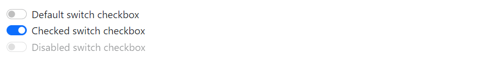
Creating Toggle Switches
The switch markup is similar to custom checkbox—the only difference is—it uses the .form-switch class to render a toggle switch. Switches also support the disabled attribute.
Let's try out the following example to understand how it basically works:
Example
Try this code »<div class="form-check form-switch">
<input class="form-check-input" type="checkbox" id="switchDefault">
<label class="form-check-label" for="switchDefault">Default switch checkbox</label>
</div>
<div class="form-check form-switch">
<input class="form-check-input" type="checkbox" id="switchChecked" checked>
<label class="form-check-label" for="switchChecked">Checked switch checkbox</label>
</div>
<div class="form-check form-switch">
<input class="form-check-input" type="checkbox" id="switchDisabled" disabled>
<label class="form-check-label" for="switchDisabled">Disabled switch checkbox</label>
</div>— The output of the above example will look something like this:
Creating Custom Select Menu
You can also customize the select dropdown menus by simply adding the class .form-select on the <select> element. However, this custom styling is limited only to the initial appearance of the <select> and cannot modify the <option>s due to browser limitations.
Example
Try this code »<select class="form-select">
<option selected>Custom select menu</option>
<option value="1">One</option>
<option value="2">Two</option>
<option value="3">Three</option>
</select>— The output of the above example will look something like this:

You can also add the disabled attribute on a custom select to give it a grayed out appearance and remove pointer events, as shown in the following example:
Example
Try this code »<select class="form-select" disabled>
<option selected>Custom select menu</option>
<option value="1">One</option>
<option value="2">Two</option>
<option value="3">Three</option>
</select>— The output of the above example will look something like this:

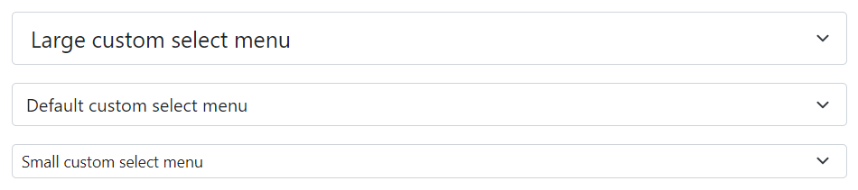
You can also create large and small variant of the custom selects to match the height of similarly sized Bootstrap's text inputs using the classes .form-select-lg and .form-select-sm on the <select> element, respectively. Let's take a look at the following example:
Example
Try this code »<select class="form-select form-select-lg">
<option selected>Large custom select menu</option>
<option value="1">One</option>
<option value="2">Two</option>
<option value="3">Three</option>
</select>
<select class="form-select mt-3">
<option selected>Default custom select menu</option>
<option value="1">One</option>
<option value="2">Two</option>
<option value="3">Three</option>
</select>
<select class="form-select form-select-sm mt-3">
<option selected>Small custom select menu</option>
<option value="1">One</option>
<option value="2">Two</option>
<option value="3">Three</option>
</select>— The output of the above example will look something like this:
Bootstrap custom select also supports multiple and size attributes like normal select:
Example
Try this code »<select class="form-select" size="3" multiple>
<option value="1">One</option>
<option value="2">Two</option>
<option value="3">Three</option>
<option value="4">Four</option>
</select>Creating Custom Range Inputs
To create custom range inputs just apply the class .form-range to the <input type="range">.
Example
Try this code »<label for="customRange">Custom range</label>
<input type="range" class="form-range" id="customRange">— The output of the above example will look something like this:

You can also add disabled attribute on the range inputs to give it a grayed out appearance and remove pointer events, as shown in the following example:
Example
Try this code »<label for="customRange">Disabled range</label>
<input type="range" class="form-range" id="customRange" disabled>— The output of the above example will look something like this:

Setting the Min and Max Values
By default range inputs have implicit values for min and max—0 and 100, respectively. But, you may specify new values for those using the min and max attributes.
Also, range inputs "snap" to integer values by default. To change this, you can specify a step value. In the following example, we've doubled the number of steps by using the step="0.5".
Example
Try this code »<label for="customRange">Custom range</label>
<input type="range" class="form-range" min="0" max="10" step="0.5" id="customRange">